National Australia Bank (abbreviated NAB, branded nab) is one of the four largest financial institutions in Australia in terms of market capitalisation and customers. NAB is ranked 17th largest bank in the world measured by market capitalisation. It operates across 10 countries serving 8.3 million consumer and business banking customers and over 2.3 million wealth management customers.
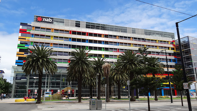
The NAB Headquarters was designed by James Grose of Bligh Voller Nield Architects and opened in 2004. Located on the prestigious Victoria Harbour Precinct at Melbourne Docklands, this project is the commercial headquarters for the National Australia Bank and Global Wealth Management. The development consists of four separate but similar seven storey buildings over a common podium and car parking levels. Various elevated connecting links are provided between the buildings for circulation.
People either love or hate this building and I must say that I would rather have had something less like a Rubik's Cube sitting on that very prominent location. I just hope that the building has a highly functional office environment inside. Nevertheless it does give opportunity for some nice shots.
This post is part of the Mellow Yellow Monday meme,
and also part of the Mandarin Orange Monday meme.


I love your photographical compositions. They have an optical illusion quality to them. Blesssings!
ReplyDeletewow,love the detail close ups and colour organisation.Mondrian like.
ReplyDeleteWhat joy for a city where alike is possible, and happening.
ReplyDeleteI remember seeing this building but I didn't realeise it was the bank's headquarters. The colours certainly make it stand out.
ReplyDeleteThese are great. I really like your compositions and their interesting perspective. And beautiful colour and pattern in the first ones. Thank you for taking part in Mandarin Orange Monday:)
ReplyDeletefabulous photos! i love the colors although it's a bit unusual for a bank.:p the light wood material give it a feeling of lightness under steel and glass.
ReplyDeletei like the 60 stools/benches.:p
Again, a very nice series!
ReplyDeleteVery 'urban'!
Greetings from The Netherlands!
What a beautiful building.
ReplyDeleteMine are here and here.